
Design and theme
Set your colors, fonts and button corners once and they apply to every page.
Change colors and fonts in the editor
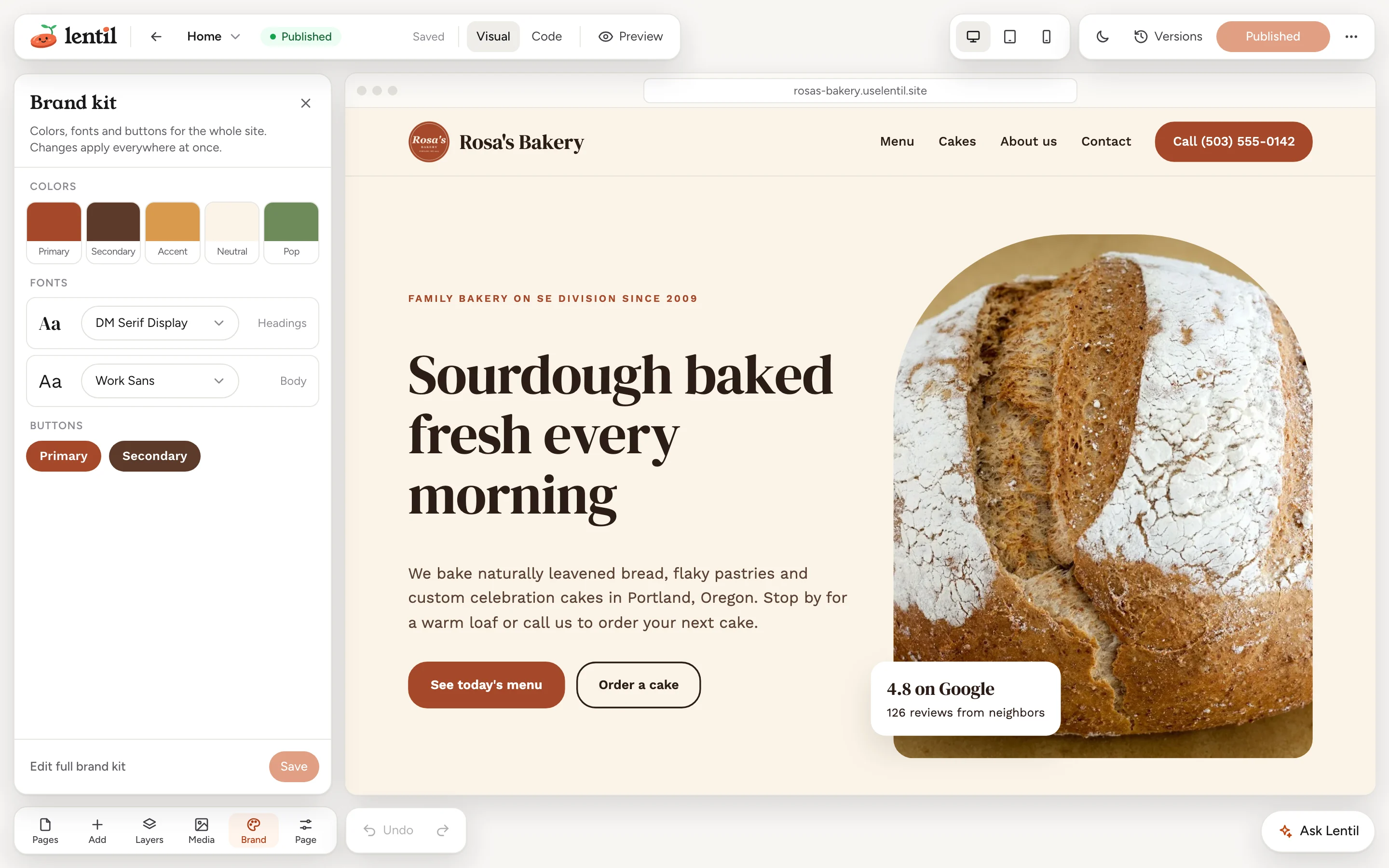
- Open a page in the editor and press Brand in the panel bar at the bottom left.
- Under Colors, press a swatch to change it: Primary (buttons and key text), Secondary (supporting text), Accent (links and highlights), Neutral (backgrounds) and Pop (badges and callouts).
- Under Fonts, choose a font for Headings and one for Body.
- Check the Buttons preview, then press Save. Reset brings back the saved values.
The panel says Changes apply everywhere at once. The page you are editing updates as you change things. Press Edit full brand kit for more options.
Theme changes are live straight awaySaving colors or fonts updates every published page right away. It does not wait for you to publish.
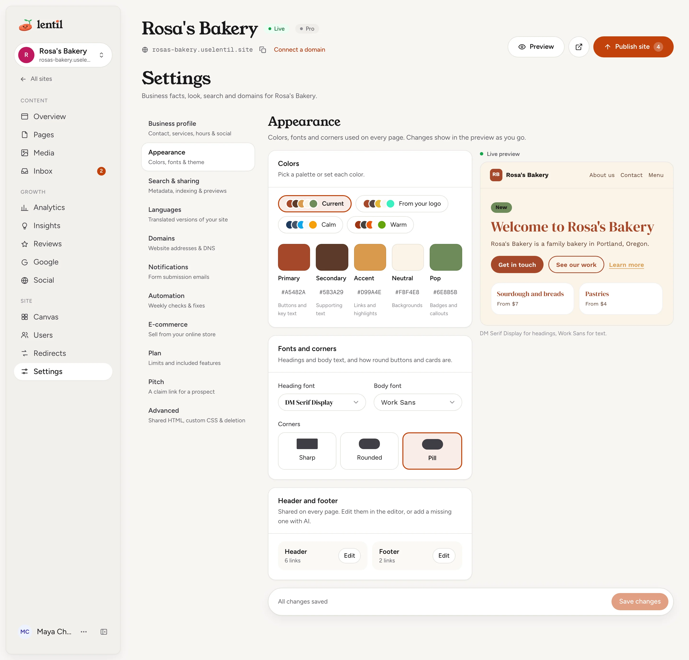
Appearance in Settings
The full brand kit is in Settings under Appearance, with a live preview next to it.
- Open Settings for your site, then Appearance.
- In Colors, pick a palette (Current, From your logo, Calm or Warm), or type each of the five colors as a hex code like
#1A2B3C. - In Fonts and corners, choose a heading font and a body font from the list of 20 Google fonts, and the button and card corners: Sharp, Rounded or Pill.
- Press Save changes, or Discard to throw the edits away. A message tells you how many published pages are being updated.
The Header and footer card has Edit (or Add) to open the shared header or footer in the editor. See The page editor.
Show me my Lentil site's current colors and fonts. Then make the buttons rounded, switch the headings to Lora, and keep the colors as they are. Tell me before you save, because theme changes go live straight away.Uses get_theme, update_theme. Connect an assistant
New looks during setupWhile you set up a new site, the designs step shows homepage designs to pick from, and a button there asks for a fresh set of looks. The first round is included; a fresh set or a described change uses credits, and the step shows about how many before you press it. See Setup and your first design.
Who can use it
- Changing colors, fonts and corners needs the permission to change site settings, which owners, admins, members and clients have. See Team and roles.
- Brand colors and fonts work on both Free and Pro. Design canvases are a Pro feature, see Design canvases.
Limits and edge cases
- Colors must be solid hex codes like
#1A2B3C(or the short form#ABC), with no transparency. In the app you pick fonts from the list of 20; an assistant can set any Google font by its family name.
From an AI assistant
See AI assistants to connect one.
get_themeandupdate_themeread and set colors, fonts and corners.
Updated 9 November 2026